
Why are diversity dashboards important? They transform workforce data into visual charts, making it easier to track representation, identify equity gaps, and monitor progress in real time. Unlike static reports, these dashboards help organizations act quickly by identifying early indicators like hiring trends or pay disparities.
What makes customization essential? Every organization has unique challenges. Custom dashboards allow companies to tailor metrics, visuals, and reports to their specific needs, whether it’s tracking hiring diversity in a small startup or monitoring pay equity in a large corporation.
Key metrics to track:
- Representation: Workforce demographics by race, gender, age, etc.
- Talent Flow: Hiring, promotions, retention rates.
- Pay Equity: Median pay comparisons and promotion opportunities.
- Inclusion: Employee sentiment, psychological safety, and belonging.
How to build one:
- Set clear goals: Define what data to track and who will use it.
- Centralize data: Combine HR, payroll, and survey data into one system.
- Visualize effectively: Use simple, clear visuals like bar charts and heat maps.
- Ensure privacy: Anonymize data and apply safeguards for small groups.
Common challenges and solutions:
- Privacy risks: Use anonymization techniques like data suppression.
- Accuracy issues: Assign data stewards, automate updates, and audit regularly.
- Bias in metrics: Break down data by demographics to uncover disparities.
Integration tips: Link dashboards to HR systems for real-time updates. Automated connections ensure data stays current, reducing manual errors. This allows organizations to track trends like engagement scores or promotion rates instantly.
A note on the numbers. An earlier version of this article opened by claiming that companies with diverse leadership “see up to 36% higher profitability”. That is a misreading of McKinsey’s research, and the correction matters, so it is dealt with properly in the section below. Several other statistics and a set of expert quotations could not be traced to any source and have been removed. So has a case study about a company called “TechCorp Global”, which is a placeholder name rather than a company.
Key Metrics for Diversity Dashboards
Core DEI Metrics
Start by establishing a baseline with representation data. This includes tracking workforce composition across categories like race, ethnicity, gender, age, sexual orientation, disability status, and veteran status.
Next, focus on talent flow – hiring, promotions, and retention. This helps uncover demographic-specific challenges, and the promotion step from entry level to manager is where they show up first. McKinsey and LeanIn’s Women in the Workplace 2023 report found that for every 100 men promoted from entry level to manager, 87 women were promoted, 73 women of colour, and only 54 Black women. Because the gap compounds at every subsequent level, a dashboard that only shows headcount at the top will show you the symptom years after the cause.
Pay equity is another critical area. Compare median pay, starting salaries, and promotion opportunities.
What McKinsey’s Profitability Research Actually Says
Two figures from McKinsey’s Diversity Wins (2020) get quoted constantly, including in earlier versions of this article, and they are almost always quoted wrongly.
What the report says is that companies in the top quartile for gender diversity on executive teams were 25% more likely to have above-average profitability than companies in the bottom quartile, and that on ethnic and cultural diversity, top-quartile companies outperformed fourth-quartile ones by 36% in profitability.
Note what that is and is not. The gender figure is a likelihood of being an above-average performer, not a margin: it does not mean a diverse company earns 25% more. Both are comparisons between the best and worst quartiles of McKinsey’s sample, and both are correlations. The report does not establish that adding diversity to a leadership team causes profit to rise, and the direction of causation is genuinely arguable, since profitable companies can afford to recruit more broadly. Use these numbers as a reason to look at your own data, not as a projection of what a dashboard will earn you.
Advanced Metrics for Inclusion
Inclusion metrics go beyond the basics to assess whether everyone in the organization feels valued and heard. The Gartner Inclusion Index, for example, evaluates inclusion through seven dimensions: fair treatment, integrating differences, decision-making, psychological safety, trust, belonging, and diversity.
Behavioral indicators also play a role. These include the use of inclusive language in job postings, identifying high-potential talent across demographics, ensuring workspace accessibility, and encouraging participation in employee resource groups. It’s also important to examine intersectional experiences, since layered identities produce experiences that neither single category captures on its own.
Instead of relying solely on annual surveys, consider using pulse surveys to capture shifts in employee sentiment more frequently, especially in hybrid work settings. Breaking down your Employee Net Promoter Score (eNPS) by demographic can help pinpoint satisfaction gaps – though be careful with small groups, for the privacy reasons set out below.
How to Build a Custom Diversity Dashboard
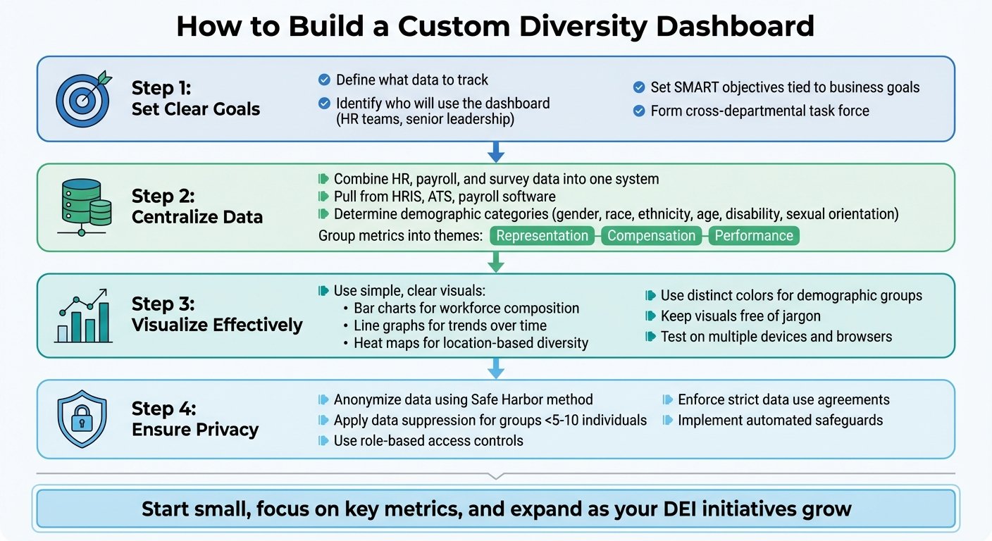
4-Step Guide to Building Custom Diversity Dashboards
Define Objectives and Data Requirements
Start by identifying who will use the dashboard. HR teams might need detailed data for hiring and succession planning, while senior leadership may prefer high-level overviews. Build for the group that will act on it, because a dashboard designed to impress a board and a dashboard designed to run a hiring process are different products.
Form a cross-departmental task force to ensure the dashboard aligns with your organization’s values. Set clear, SMART objectives that tie directly to your business goals, such as addressing representation gaps, pay equity, or promotion trends.
Next, determine where your data will come from. Most organizations pull information from systems like Human Resource Information Systems (HRIS), Applicant Tracking Systems (ATS), payroll software, and employee engagement surveys. Decide which demographic categories – such as gender, race, ethnicity, age, disability status, and sexual orientation – you’ll analyze, and group metrics into themes like representation, compensation, and performance.
Use inclusive, human-centered language throughout the process. For instance, replace technical terms like “non-resident aliens” with “international employees” after consulting with diverse employee groups about their preferences. Keep in mind that as your DEI goals evolve, your objectives and data requirements should adapt as well.
Data Collection and Standardization
Bring together data from HRIS, ATS, payroll, and equity platforms into one centralized system to maintain consistency. Moving from an annual survey to a regular feed is the change that makes a dashboard worth building: annual data tells you what happened, and by the time you read it the people who left have gone.
Standardize demographic labels by consulting employee groups to ensure language is inclusive. Normalize data across various dimensions – like departments, management levels, office locations, and hire dates – to uncover meaningful patterns. For example, when evaluating compensation, include base salary, bonuses, and equity to get a full picture of wealth distribution. Bonus and equity are where pay gaps hide when base salary bands look clean.
Also, calibrate performance metrics across demographic groups to identify potential biases. Analyzing performance ratings by race, ethnicity, and gender can expose systemic disparities that aggregate scores conceal.
Benchmark your internal data against industry standards or national statistics to provide context. Combine quantitative data with qualitative insights from exit surveys and focus groups to better understand trends like high turnover. Finally, prioritize data security and anonymization to protect sensitive information and build employee trust.
Once your data is unified and standardized, the next step is to focus on making it visually clear and easy to understand.
Design and Visualization Best Practices
Choose visualizations that clearly communicate your data. Line graphs can show trends in pay equity or engagement scores over time, stacked bar charts can display workforce composition by race or gender, and heat maps can highlight diversity across office locations.
Use distinct colors to represent different demographic groups and keep visuals simple and free of jargon so they’re accessible to everyone, from executives to entry-level employees. Test the dashboard on multiple devices and browsers to confirm it renders correctly.
Connecting the dashboard directly to your HRIS or ATS platforms enables real-time updates, reducing manual errors and keeping the data current. Start small by tracking a few key metrics, and expand as your DEI initiatives mature. Comparing internal KPIs with industry benchmarks or past performance can also provide valuable insights.
One design warning. Percentages on small populations move violently and mean very little: in a team of eight, one person leaving is a 12.5 point swing. Show counts alongside percentages, or your dashboard will generate monthly crises out of ordinary staff turnover.
Common Challenges and Solutions
Creating effective diversity dashboards comes with its share of challenges, particularly around privacy, accuracy, and bias. Addressing these issues is key to delivering meaningful and reliable insights.
Data Privacy and Anonymization
Safeguarding employee information is a critical concern. Even when direct identifiers like names are removed, individuals can still be identified: research on re-identification has repeatedly shown that a combination of date of birth, gender and postal code is enough to single out a large share of a population. This risk becomes far more pronounced in smaller teams or leadership levels, where demographic profiles are more distinct. In a department of twelve with one woman over fifty, no amount of removing names makes her data anonymous.
Legal teams often worry that collecting diversity data creates a record that could be used in a discrimination claim. That concern is real and worth taking seriously rather than dismissing, and it is also not a reason to avoid measuring: the standard answer is to control who can see what, aggregate aggressively, and be clear about why the data is held.
Practical safeguards include data suppression (grouping ages into ranges, and only reporting a metric when a group contains at least five to ten individuals), removing the specific identifier combinations that enable re-identification, and getting an expert assessment of residual risk for anything you publish externally. When sharing dashboard access with managers or external parties, enforce strict data use agreements that prohibit attempts at re-identification.
Once privacy is secured, the next step is ensuring your data remains accurate and up-to-date.
Maintaining Data Accuracy
Accurate data forms the backbone of any reliable dashboard. For diversity dashboards, accuracy depends on five factors: completeness (all necessary fields are filled), accuracy (data reflects reality), consistency (data is uniform across systems), timeliness (information is current), and traceability (data lineage is clear).
To achieve this, assign data stewards – dedicated individuals responsible for verifying and updating records. Implement Master Data Management to centralize employee data, eliminating inconsistencies across departments. Integrate your dashboard with HRIS and ATS platforms to minimize manual entry errors, and use automated tools to flag anomalies before they reach reports.
Watch the completeness rate on self-reported demographic fields specifically. If half your staff have not answered, your representation chart is a chart of who felt comfortable answering, which is itself a finding but not the one the chart claims to show.
Regular audits are also crucial. These should include testing system controls, reviewing workflows, and sampling datasets to confirm accuracy. Finally, set a consistent refresh schedule – monthly, quarterly, or annually – based on your organization’s size and hiring activity.
Bias in Metrics and Analysis
Even the best dashboards can unintentionally perpetuate bias if not carefully designed. Performance ratings are the clearest example, because they are subjective judgements presented as numbers, and a dashboard renders them as objective simply by charting them.
Two versions of a quotation about performance scrutiny, attributed to The Atlantic by way of ChartHop, previously appeared in this article, worded differently in each place. We could not locate the original in either form, so both have been removed rather than one being picked.
To uncover and address disparities, break down performance and compensation data by race, ethnicity, gender, job level, and location. Use tools like the four-fifths rule to detect adverse impact – if the selection rate for a protected group is less than 80% of the highest-scoring group, there may be inequity. When analyzing pay, investigate whether lower averages stem from pay inequities or underrepresentation in higher-paying roles. Those two problems look identical on a dashboard and need completely different responses.
Finally, collect diversity data through voluntary self-reporting rather than relying on managers’ observations. This approach not only improves accuracy but also respects employees’ identities.
Integrating Dashboards with Business Tools
After addressing privacy and accuracy concerns, the next logical step is linking your diversity dashboard to the tools your organization already relies on. Integration not only eliminates tedious manual data entry but also ensures your metrics stay current, reflecting real-time organizational changes instead of outdated snapshots.
Connecting with HR and Recruitment Platforms
Your diversity dashboard becomes far more effective when it pulls data directly from your ATS and HRIS. By using REST APIs and automated data feeds, you can consolidate payroll, performance reviews, and engagement survey data into one centralized view.
This section previously carried a case study about “TechCorp Global”, which supposedly raised representation of women and underrepresented minorities in director-level roles by 27% in Q4 2024 and lifted diverse talent retention from 74% to 91%. TechCorp Global is a placeholder name, not a company, and no such results are published anywhere. The whole example has been deleted. We are flagging it rather than quietly removing it because a fabricated success story is worse than no example at all, and readers of the earlier version deserve to know it was there.
A genuinely useful integration detail: assign unique, persistent identifiers to every employee across all systems. Without them, someone who changes their name or moves department appears as two people, and your retention numbers become fiction. Reconciling those duplicates by hand later is the single largest time sink in this kind of project.
Real-Time Reporting and Updates
Switching from quarterly PDF reports to live dashboards changes what the data is for. A report that takes weeks to compile describes a past state, and by the time it lands the decisions it should have informed have been made.
Modern dashboards, powered by automated data feeds and API connections, update metrics as changes occur in your systems. Whether it’s a new hire completing onboarding, a promotion, or feedback from a pulse survey, this information flows into your dashboard without anyone rekeying it. With current data, you can monitor leading indicators like 90-day engagement scores and interview-to-offer ratios rather than only lagging ones like annual turnover.
Most major HR platforms publish APIs for employee demographic and payroll data, typically secured with OAuth 2.0. Check what your existing HRIS actually exposes before choosing a dashboard tool, because the integration you can build is bounded by that, not by the dashboard’s marketing.
To protect privacy while maintaining functionality, implement role-based access controls and automated data suppression for groups with fewer than five individuals. This allows managers to filter and analyze data independently without compromising confidentiality.
Conclusion
Benefits of Custom Diversity Dashboards
Custom diversity dashboards let organizations make decisions on current data rather than annual snapshots. Leadership can spot a decline in retention among a specific group and act on it, instead of learning about it from an exit interview summary two quarters later.
Dashboards also create accountability, simply by making workforce composition, pay gaps and promotion rates visible to people who can change them. That is the honest case for building one. The financial case, per the McKinsey figures discussed above, is a correlation between quartiles rather than a promised return, and anyone selling you a dashboard on the basis of guaranteed profit growth is overstating what the research shows.
Be clear-eyed about the limit, too: a dashboard measures. It does not fix anything. If the numbers it surfaces do not lead to changes in how people are hired, paid and promoted, you have bought a reporting tool and called it a strategy.
Getting Started with Implementation
Begin by defining your audience – whether it’s HR, leadership, or external stakeholders – and tailor the dashboard to meet their needs. Assemble a cross-department task force to incorporate diverse viewpoints into the design process.
Prioritize three key metric areas: representation (workforce demographics), compensation (pay equity), and performance (promotion rates and engagement). Integrating the dashboard with existing business administration tools like HRIS or ATS platforms helps automate updates and minimize manual errors. To safeguard privacy, use role-based access controls and aggregate data for smaller groups.
Start small by focusing on a few critical metrics, then expand based on user feedback. Offer training resources, such as videos or guides, to help managers interpret the data – particularly the small-numbers problem, which otherwise produces panic every time one person resigns. For a first attempt, a general-purpose tool such as Looker Studio connected to an HRIS export is usually enough to find out which metrics your organisation will actually use before you pay for a dedicated platform.
FAQs
What are the benefits of custom diversity dashboards for small organizations?
Custom diversity dashboards give small organizations a clear, visual way to understand their workforce demographics and diversity, equity, and inclusion (DEI) metrics. These tools make it easier to spot underrepresented groups, track progress over time, and evaluate how well inclusion efforts are working.
One caution specific to small organisations: with a headcount under about fifty, most demographic breakdowns will be too small to report without identifying individuals, and percentage changes will be dominated by noise. At that size, counts and a written commentary are more honest than a chart, and cheaper to produce.
How can organizations ensure their diversity dashboard data is accurate?
Start by pinpointing and gathering key DEI metrics, such as workforce representation, pay equity, and performance data. Make sure this information is both thorough and relevant to your goals. A critical step here is data validation – always cross-check your sources and confirm the accuracy of the data before adding it to your dashboards.
It’s also important to regularly review and analyze trends over time. This helps uncover any inconsistencies or gaps in the data. Track the response rate on self-reported fields as a metric in its own right, since incomplete demographic data quietly distorts every chart built on it.
Do diversity dashboards improve profitability?
Not on their own, and be sceptical of anyone who says otherwise. The research usually cited here is McKinsey’s Diversity Wins, covered above, which found that companies in the top quartile for executive gender diversity were 25% more likely to post above-average profitability than those in the bottom quartile, and that top-quartile ethnic diversity was associated with 36% better profitability performance against the fourth quartile.
Those are correlations between the best and worst quartiles of a sample, not a measured effect of any intervention, and certainly not an effect of buying a dashboard. What a dashboard does is show you where representation, pay and promotion actually stand in your organisation. Whether anything improves after that depends on what you change.
More on this topic
Browse all 53 articles on Data & Analytics.