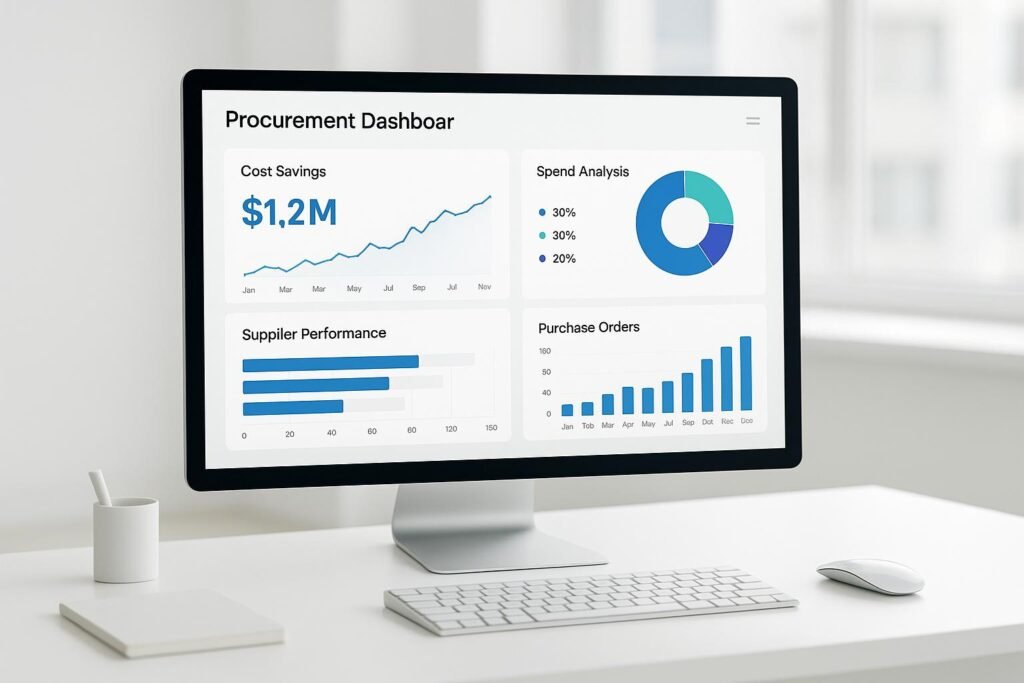
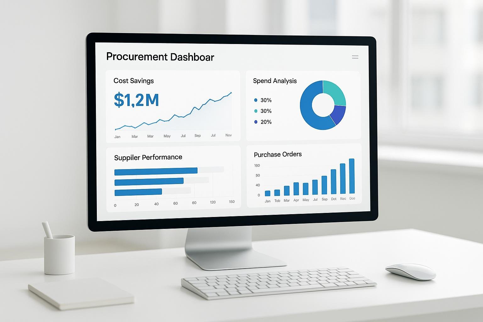
Procurement dashboards are useful when they track a small number of metrics somebody acts on. Here are ten that earn their place:
- Spend Under Management: The share of spending running through approved suppliers and contracts.
- Maverick Spend: Purchases made outside approved processes.
- Supplier Performance Score: A composite of quality, delivery and cost.
- Purchase Order Cycle Time: Request to issued PO.
- Supplier Lead Time: Order to delivery.
- Contract Compliance: Whether the agreed price, terms and quality are actually delivered.
- Cost Savings and Discounts: Savings from negotiation, volume and early payment.
- On-Time Delivery Rate: How often suppliers hit the agreed date.
- Inventory Turnover Rate: How often stock sells and is replaced.
- Number of Active Suppliers: The balance between diversity and concentration.
A note on benchmarks. An earlier version of this article carried several benchmark figures — typical seasonal lead-time increases, expedited freight premiums, a savings range from acting on lead-time data, a supplier count per billion of spend, and a statistic attributed to “an MIT study”. None of them linked to a source and none could be traced to one, so they have been removed rather than restated.
If you need real benchmark data rather than numbers from an article, APQC publishes procurement benchmarking guidance and maintains a benchmark library covering PO cycle time, procure-to-pay cycle time, supplier lead time, on-time delivery and cost to perform procurement. That is where a defensible comparison figure comes from. Your own trend against your own baseline is the other reliable source.
How to Choose the Right Procurement KPIs
Pick metrics that are relevant, measurable and actionable. Most dashboards fail the third test.
Align the KPIs to what your organisation is actually trying to do. A manufacturer usually cares about lead time and on-time delivery. A services business usually cares about cost savings and contract compliance.
Choose things that can be counted. “Supplier relationship quality” is not a metric; delivery timeliness, defect rate and response time are.
Require that each KPI can trigger an action. Tracking maverick spend is only useful if someone follows up on the departments generating it.
Identify your top three to five priorities — reducing cost, improving supplier performance, ensuring compliance, increasing efficiency — and attach specific KPIs to each. Keep the total manageable, in the region of eight to twelve core metrics, and group them into categories such as cost, supplier performance and operational efficiency.
Then check you can actually get the data. Audit your ERP, supplier portals and contract management tools before promising a metric. Half-populated KPIs erode trust in the whole dashboard.
1. Spend Under Management
The percentage of total procurement spend flowing through approved contracts, suppliers and processes. Divide managed spend by total spend and multiply by 100.
Worked example: $7 million managed out of a $10 million budget gives 70%.
Why it matters
Spend outside management is spend you have no negotiated price on, no quality terms for, and no visibility into. Raising this figure is usually the single largest structural saving available to a procurement function.
How to track it
Pull spend by supplier from the finance system and classify each supplier as on-contract or not. The classification is the hard part; it needs maintaining as contracts expire.
What to do with it
Break the unmanaged portion down by category and by department. The answer is nearly always concentrated rather than spread evenly, which tells you where to start.
2. Maverick Spend
The percentage of spend occurring outside approved contracts, suppliers or processes. Divide off-contract purchases by total procurement spend and multiply by 100.
Worked example: $2 million off-contract out of a $10 million budget gives 20%.
Why it matters
Maverick spend costs more per unit and carries unassessed supplier risk. It is also the metric most likely to be understated, because purchases made on personal cards or through expenses often never appear in procurement data at all.
How to track it
Compare purchase transactions against the approved supplier list and contract catalogue. Include expense-claim purchases in the denominator, or you are measuring only the maverick spend that was easy to see.
What to do with it
Find out why it happens before enforcing against it. In most organisations the top cause is that the approved route is slower than the unapproved one. Fixing the process reduces maverick spend more reliably than a policy reminder.
3. Supplier Performance Score
A composite score per supplier, typically weighting quality, delivery reliability, responsiveness and cost.
Why it matters
It converts scattered impressions about a supplier into something you can put in front of them, and it makes renewal decisions defensible.
How to track it
Define the components and their weights in advance, and keep them stable. A score whose formula changes is not comparable over time. Draw quality data from goods-receipt records rather than from memory.
What to do with it
Share the score with the supplier. A scorecard nobody sees changes nothing. Use it to direct volume toward strong performers and to structure improvement plans for weak ones.
One caution: composite scores hide their components. A supplier can score adequately overall while failing badly on the one dimension you care about, so always show the breakdown alongside the total.
4. Purchase Order Cycle Time
The elapsed time from purchase request to issued purchase order.
Why it matters
Long cycle times are the most common cause of maverick spend. If approval takes longer than the requester can wait, they will find another route.
How to track it
Measure by category rather than as a single average, because the profile differs sharply — routine office supplies and IT equipment requiring security review are not comparable, and averaging them hides both. Automated alerts can flag POs exceeding your target. Platforms like BizBot list tools that surface this in real time.
APQC publishes PO cycle time benchmarks split by goods and services, which is the right comparison if you want an external reference point.
What to do with it
Look at where the time sits. It is usually waiting for one approval rather than the processing itself. Approval thresholds and delegation are the levers.
5. Supplier Lead Time
The time from placing an order to receiving the goods.
Why it matters
Lead time drives safety stock. A short lead time lets you reorder frequently and hold less; a long one forces a buffer, which is working capital sitting still.
How to track it
Record promised lead time and actual lead time separately. The gap between them matters more than either number, because that gap is what your planning has to absorb.
Track variability as well as the average. A supplier with a consistent longer lead time is easier to plan around than one whose delivery time swings unpredictably, even if the second has a better mean.
What to do with it
Lead times generally lengthen during peak periods, so use your own historical data to adjust ordering schedules rather than a generic seasonal uplift. Expedited freight costs substantially more than planned shipping — how much more depends on mode, lane and urgency, so price it from your own quotes rather than from a rule of thumb.
6. Contract Compliance
How closely actual purchases match the agreed pricing, delivery and quality terms.
Why it matters
Negotiated savings that are not enforced are not savings. Price creep against contracted rates is common and rarely noticed without a specific check.
How to track it
Compare invoiced prices against contracted prices at line level. This is tedious manually and is the strongest argument for contract management software in a mid-sized procurement function.
What to do with it
Raise variances with the supplier promptly and in writing. Most price discrepancies are correctable; few are correctable a year later.
7. Cost Savings and Discounts Captured
Savings realised from negotiation, consolidation, volume and early payment terms.
Hard savings versus soft savings
- Hard savings are measurable. If a negotiation reduces unit cost from $10.00 to $8.50, the $1.50 per unit is real and appears in the accounts.
- Soft savings — cost avoidance, administrative time recovered — are genuine but do not show up as reduced spend. Report them separately and label them clearly. Mixing the two is the fastest way for a procurement team to lose credibility with finance.
Early payment discounts
Worked example: capturing a 2% early payment discount on a $500,000 purchase saves $10,000.
Before chasing these, check the trade-off. Paying early costs you working capital, and a 2% discount is only worth taking if the return beats what that cash does elsewhere. Calculate the annualised rate rather than looking at the headline percentage.
What to do with it
Baseline against last paid price rather than list price. Savings measured against list price are usually fiction.
8. On-Time Delivery Rate
The share of deliveries arriving by the agreed date.
How to track it
Define “on time” precisely, including whether a partial delivery counts and what tolerance window applies. Two organisations measuring on-time delivery differently cannot compare results, and neither can two departments in the same organisation.
What to do with it
Record the reason for each late delivery — supplier, transport, weather, your own late ordering. That last category is more common than procurement teams expect, and it is the only one you can fix directly.
Strong performers can be rewarded with volume or preferred status; persistent underperformance warrants backup sourcing. Set the threshold for “strong” from your own data and category norms. An earlier version of this article stated a specific rate as the typical threshold; it was unsourced and has been removed. APQC publishes supplier on-time delivery benchmarks if you want an external comparison.
9. Inventory Turnover Rate
How many times inventory is sold and replaced in a period. Divide cost of goods sold by average inventory value.
Why it matters
Low turnover means cash tied up in stock and rising obsolescence risk. Very high turnover can mean you are running too lean and risking stockouts.
How to track it
Calculate it by category, not across the whole inventory. Fast-moving consumables and slow-moving spares have entirely different expected profiles, and a blended figure describes neither.
What to do with it
Pair it with stockout frequency. Turnover improving while stockouts rise is not an improvement; it is risk being transferred to operations.
10. Number of Active Suppliers
The count of suppliers with activity in a period, ideally split by category.
Why it matters
Too many suppliers dilutes purchasing power and multiplies administrative cost. Too few concentrates risk, and a single-source failure stops production.
An earlier version of this article gave an average supplier count per billion of spend, and attributed a statistic about supplier dependency to an unnamed MIT study. Neither could be sourced and both have been removed. There is no universal right number — it depends on industry, category structure and risk tolerance.
How to track it
Count suppliers with transactions in the period, not suppliers on the master file. Vendor master files accumulate dormant records and overstate the real number, often substantially.
What to do with it
Look at the long tail. In most organisations a large share of suppliers accounts for a small share of spend, and consolidating that tail is administratively cheap and low risk. Separately, identify categories with a single source and decide deliberately whether that is acceptable.
Dashboard Design and KPI Tracking Methods
Group related KPIs and match the dashboard to who is reading it:
- Strategic dashboards: for executives. Total savings, spend under management, supplier risk concentration.
- Operational dashboards: for procurement managers. PO cycle time, on-time delivery, open exceptions.
- Analytics dashboards: for analysts. Trends, category detail, variance analysis.
Keep each dashboard to a handful of KPIs on a single screen. A dashboard that requires scrolling gets read once.
Specialised dashboards
- A savings dashboard for realised savings and cost avoidance, shown separately.
- A supplier performance dashboard for scores, compliance and delivery.
- A spend dashboard for spend under management, maverick spend and turnover.
Data sources
Connect to the ERP and procurement systems directly rather than exporting to spreadsheets. Manual refreshes stop happening, and a stale dashboard is worse than none because people still trust it.
Visual choices
- Line charts for trends over time.
- Bar charts for comparison across categories or suppliers.
- Tables for supplier-by-supplier detail.
Always show the trend alongside the current value. A single number without direction tells the reader nothing about whether to act.
Keeping Your Procurement Dashboard Current
Review the KPIs, not just the data
A metric that mattered a year ago may not now. Review the set periodically — quarterly suits most organisations — and ask of each one: has anyone acted on this in the last quarter? If not, either the metric is wrong or nobody owns it. Remove it or fix the ownership.
Watch for definition drift
Definitions change quietly as systems are reconfigured, and a trend line that spans a definition change is misleading. Record the definition alongside the metric and note the date whenever it changes.
Conclusion
A procurement dashboard is worth building when it changes decisions: which supplier gets the next order, which contract gets renegotiated, which department needs a conversation about off-contract buying.
The ten KPIs above cover cost, supplier performance and operational efficiency. Start with three or four, measure your own baseline, and add more only when someone asks for them.
On benchmarks: use a published source such as APQC’s benchmark library if you need external comparison, and otherwise compare against your own history. Figures that circulate without attribution — including several removed from this article — are not a basis for a target.
FAQs
How can procurement teams monitor and reduce maverick spending?
Track spend against the approved supplier list and flag off-contract purchases automatically. Categorise the results by department and by category; non-compliance concentrates rather than spreading evenly.
Then investigate the cause before enforcing. Where the approved route is slower than the alternative, people will keep going around it regardless of policy. Fixing the approval path usually does more than an audit.
How can businesses improve supplier performance?
Agree the metrics and the scorecard with the supplier up front, so the first time they see a score is not during a dispute. Review performance on a set schedule rather than only when something goes wrong.
Use standardised evaluation criteria so suppliers are compared on the same basis, and share the underlying data. Suppliers can rarely fix a problem described only as a low score.
How can organisations balance supplier count with efficiency?
Segment suppliers by strategic importance rather than treating them as one list. Consolidate the long tail of low-spend suppliers, which is mostly administrative cost, and treat single-source categories as a separate risk decision.
There is no correct number of suppliers. There is a correct process: know which categories are concentrated, know why, and decide deliberately rather than by accident.
More on this topic
Browse all 53 articles on Data & Analytics.