Disclosure: This page contains commercial links. BizBot may earn a commission from qualifying purchases. Paid placements do not buy a better ranking. Read our affiliate disclosure.
Feedback visualization tools are essential for businesses to transform raw data into clear visuals, enabling faster decisions and better customer satisfaction. These tools simplify data interpretation through charts, dashboards, and AI-driven insights, helping teams identify trends and act quickly. Below are the top 10 tools, their standout features, pricing, and best use cases:
- Sisense: Advanced analytics with AI-powered insights and real-time dashboards. Custom pricing. Ideal for large-scale data analysis.
- Venngage: Drag-and-drop infographics and templates for non-designers. Premium is $10 per user per month billed yearly ($19 month-to-month). Great for marketing visuals.
- Infogram: Interactive charts and maps with live data updates. Pro is $19 a month billed yearly. Perfect for quick, engaging reports.
- SurveyMonkey: Survey creation with automated visual reporting. Team Advantage is $30 per user per month, minimum three users, billed annually. Best for customer and employee feedback.
- Mopinion: Website-specific feedback with advanced targeting. Standard starts at €279 a month — Mopinion prices in euros, not dollars. Designed for enterprise-level use.
- UserZoom: UX research with heatmaps and journey mapping. Now sold as UserTesting after the two companies merged. Custom pricing. Tailored for usability testing.
- Atarim: Real-time website annotation for design feedback. Custom pricing. Built for web developers and agencies.
- Canva: Easy-to-use design platform for branded reports. Pro is US$180 a year for one person. Ideal for small teams and freelancers.
- Feedbackify: Simplified feedback widgets and analytics. Publishes no price. Focused on website user feedback.
- Zoho Survey: Integrated with Zoho tools, offering multilingual surveys. Zoho does not show rates on its US pricing page. Suitable for businesses already using Zoho.
Quick Comparison Table:
| Tool | Key Features | Starting Price | Best For |
|---|---|---|---|
| Sisense | AI insights, real-time dashboards | Custom pricing | Large organizations |
| Venngage | Infographics, templates | $10/user/month, billed yearly | Marketing visuals |
| Infogram | Interactive charts, live updates | $19/month, billed yearly | Quick reports |
| SurveyMonkey | Survey creation, auto visuals | $30/user/month, 3-user minimum | Customer/employee feedback |
| Mopinion | Website feedback, targeting | From €279/month | Enterprise-level businesses |
| UserZoom (now UserTesting) | UX research, heatmaps | Custom pricing | Usability testing |
| Atarim | Website annotation, collaboration | Custom pricing | Web developers/agencies |
| Canva | Drag-and-drop design | US$180/year per person (Pro) | Small teams, freelancers |
| Feedbackify | Feedback widgets, analytics | Not published | Website user feedback |
| Zoho Survey | Zoho integration, multilingual | Not published | Zoho ecosystem users |
Every price in this article was checked against the vendor’s own pricing page in August 2026. Several had changed since this piece was first published, and two vendors had renamed their plans. Confirm the current rate before you budget.
These tools cater to different needs, from enterprise analytics to simple infographics, making it easier for businesses to choose one based on their size, budget, and goals.
1. Sisense
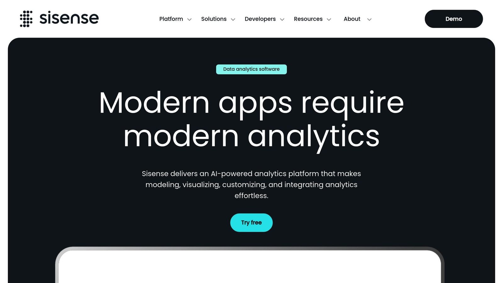
Sisense turns raw feedback data into actionable insights, making it a go-to platform for organizations managing large volumes of customer and employee feedback.
The platform’s standout feature is its ability to handle feedback from multiple sources at once without compromising performance. Whether you’re sifting through thousands of survey responses or analyzing real-time user comments, Sisense delivers powerful, interactive visualizations.
Customizable Visualizations
Sisense offers a wide range of customizable visualization tools that go far beyond basic charts and graphs. Using its intuitive drag-and-drop interface, users can design interactive dashboards, dynamic heat maps, and multi-layered data displays.
The platform’s AI capabilities take it a step further by automatically spotting feedback patterns and recommending the best visualizations. Users can tweak colors, layouts, and filters in real time, making it easy to move between high-level overviews and detailed deep dives into specific feedback segments.
Sisense also includes advanced storytelling tools that help teams craft engaging presentations. These features are perfect for showcasing key feedback trends and their potential business impacts. It also connects to a wide range of other tools.
Integration with Other Tools or Platforms
One of Sisense’s biggest strengths is its ability to integrate with a range of tools and platforms. It connects with popular applications like Salesforce, Google Analytics, Excel, and cloud services such as AWS and Azure. For US-based businesses, this flexibility is a major advantage. Real-time data syncing ensures that visualizations are always up-to-date, helping teams respond quickly to customer concerns.
Pricing Options and Plans
Sisense uses a custom pricing model tailored to each organization’s needs. Instead of fixed rates, pricing depends on factors like the number of users, data connectors, and desired advanced features. To help businesses decide if it’s the right fit, Sisense offers free trials and demos.
Use Cases for Different Industries or Teams
Thanks to its advanced analytics, Sisense proves useful across a variety of industries. In the US, it’s particularly effective in healthcare, finance, retail, and technology:
- Healthcare: Visualize patient feedback to identify areas for service improvement.
- Retail: Analyze customer satisfaction trends to fine-tune product offerings.
- Technology: Use real-time analytics to monitor user feedback and enhance software development.
- Finance: Track client satisfaction and gather feedback for regulatory compliance.
Sisense has a real learning curve, and it is the kind of platform you budget training time for. If nobody on your team has run a BI tool before, start somewhere simpler.
2. Venngage
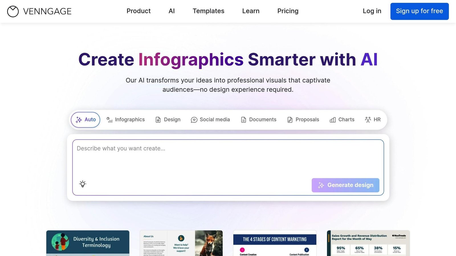
Venngage turns feedback data into visually engaging stories through infographics, charts, and diagrams, making insights easier to understand and share across your organization.
The platform simplifies the process of transforming raw survey responses into polished visuals, no advanced design skills needed. Just copy and paste your data from spreadsheets, and Venngage does the heavy lifting, converting it into eye-catching graphics with minimal effort.
This simplicity is paired with powerful customization options.
Customizable Visualizations
Venngage provides a rich library of customizable templates, including infographics, diagrams, maps, and interactive charts. Its intuitive drag-and-drop interface allows even non-designers to create branded visuals using custom fonts, colors, icons, and images. These tools make it easy to turn complex data into clear, actionable visuals. Features like icons and maps enhance storytelling, ensuring your message is both impactful and easy to follow.
Integration with Other Tools
Venngage supports direct data imports from tools like Excel and Google Sheets, streamlining the process of creating visuals. While it doesn’t integrate with every feedback platform, its flexible data import capabilities fit most workflows. Plus, real-time collaboration features let team members edit and comment on designs simultaneously, which keeps review cycles short.
Pricing Options and Plans
Venngage offers pricing plans tailored to different business needs. A free version is available, though it comes with limited templates and export options. Premium is $10 per user per month on yearly billing, or $19 month-to-month. Business is $24 per user per month yearly, or $49 month-to-month, and adds team collaboration, brand customization, shared folders and priority support. Enterprise starts at $499 a month with a ten-member minimum. Read from Venngage’s pricing page in August 2026 — note the headline $10 is the annual rate, not what you pay by the month.
Use Cases Across Industries
Venngage proves useful in a variety of industries where clear and engaging feedback visualization is essential. Marketing teams rely on it to present customer survey results in visually appealing formats for campaign analysis and stakeholder presentations. HR departments use it to turn employee feedback into concise reports and executive summaries. Educators find it helpful for displaying student feedback and performance data in easy-to-understand visuals. Product teams also benefit by using Venngage to highlight user feedback trends in a way that grabs attention.
That said, organizations seeking deep analytical tools may find Venngage’s focus on presentation somewhat limiting.
3. Infogram
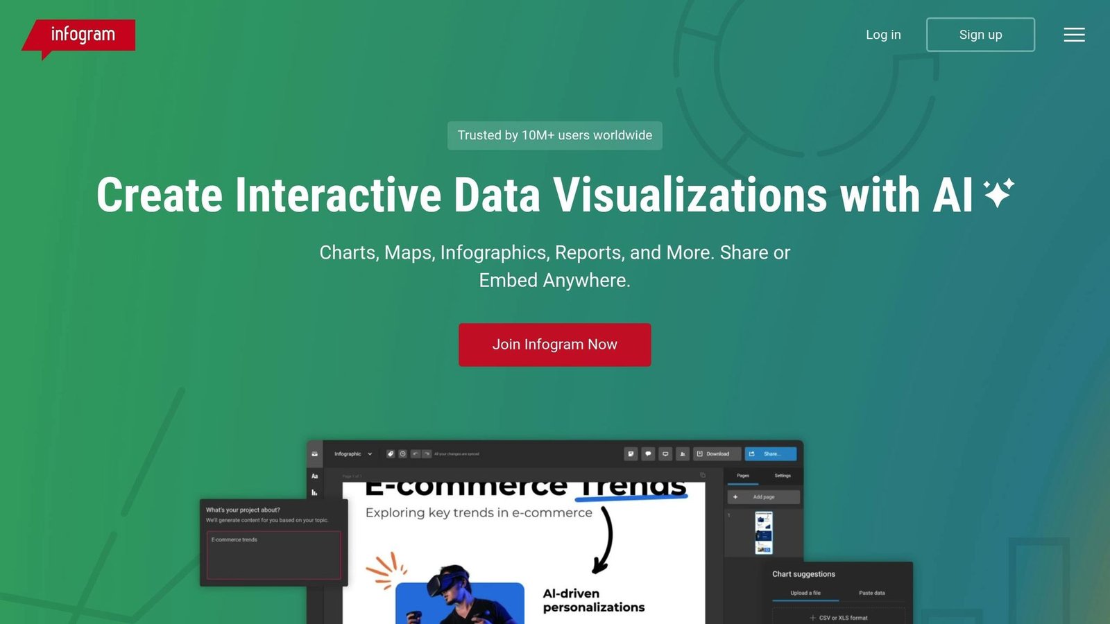
Infogram rounds out our review of data visualization tools by focusing on interactive visual design. Infogram turns raw data into interactive graphics that anyone can build. Its goal? Making data visualization simple and accessible, no matter your skill level.
The platform’s drag-and-drop interface is user-friendly and doesn’t require coding or design experience. Just upload your data, and you’re ready to create polished visuals for presentations, reports, or team discussions. Infogram combines creative design options with real-time data updates, helping users make quick, informed decisions.
Customizable Visualizations
Infogram’s library is packed with options: over 550 map types and 35+ chart styles. Whether it’s a bar chart showing customer satisfaction trends or an interactive pie chart breaking down employee feedback, the platform offers plenty of ways to customize your visuals.
You can tweak colors, fonts, layouts, and interactive elements to align with your brand or emphasize key points. Features like hover details and filters allow viewers to interact with the data, making it more engaging.
For example, marketing teams often use stacked bar charts to compare satisfaction levels across regions, while HR departments rely on pie charts to analyze employee feedback by category. This flexibility turns raw data into insights that teams can act on.
Integration with Other Tools
Infogram integrates smoothly with tools like Google Drive, Dropbox, Microsoft Excel, and Slack. Imagine pulling survey results from Google Sheets, creating a visual report in Infogram, and sharing it instantly in a Slack channel for team discussions.
One standout feature is its live data connection, which keeps dashboards up to date as new data comes in. For instance, a product team tracking feature requests can see their dashboard refresh daily without any manual updates. This real-time capability allows teams to respond faster and collaborate more effectively, with multiple users able to work on the same project simultaneously.
Pricing Options and Plans
Infogram offers plans to fit a variety of needs:
- Free Plan: Includes basic features and templates, ideal for individuals or small teams testing the waters of data visualization.
- Pro Plan: Starts at $19/month (billed annually) and adds more templates and branding options.
- Business Plan: $67/month (billed annually) and includes brand customization, analytics, and integrations.
- Team Plan: $149/month (billed annually) for 3–10 users.
- Enterprise Plan: Contact Infogram, for 10+ users.
All pricing is in US dollars and all the paid tiers above are annual rates; month-to-month costs about 24% more. Checked August 2026 — these were the only figures in this article that had not drifted.
Use Cases Across Industries
Infogram’s versatility makes it a go-to tool for many industries:
- Education: Universities use it to visualize course evaluations, helping faculty pinpoint areas for improvement with clear, easy-to-read reports.
- Healthcare: Providers create dashboards to track patient satisfaction across facilities, driving improvements in care quality.
- Marketing: Teams transform survey data into visual stories for client reports, making complex data easier to understand.
- Non-profits: Clear visuals are key for stakeholder reporting and grant applications, and Infogram delivers.
- Product Teams: Real-time dashboards help monitor surveys and customer support data, supporting agile decision-making.
Infogram also stands out for its ability to embed interactive visuals into websites, presentations, and social media, making it an essential tool for sharing insights across multiple platforms.
Infogram is not a business intelligence tool and does not pretend to be one. It makes good-looking charts quickly and exports them cleanly. A review score quoted here previously has been removed — scores move, so check the current G2 and Capterra listings yourself.
4. SurveyMonkey
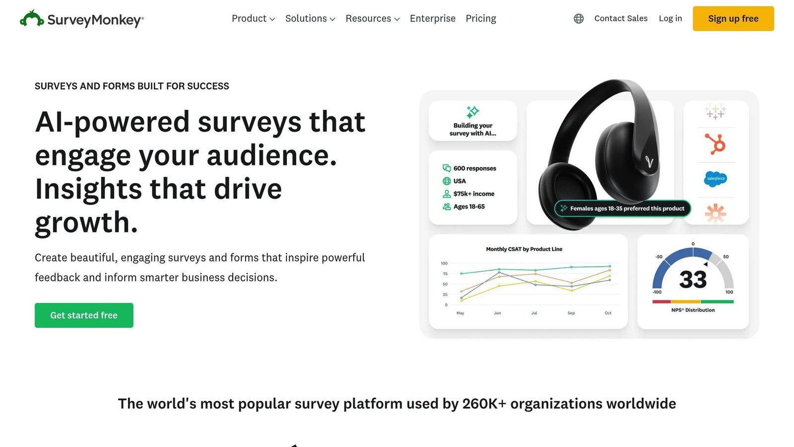
SurveyMonkey is a powerful survey platform that blends data collection with real-time visualization. It automatically turns survey responses into charts, graphs, and visual reports, giving teams instant access to insights. This makes it especially useful for organizations that need quick feedback to inform decisions.
From creating surveys to generating visual reports, SurveyMonkey simplifies every step of the feedback process. With millions of users worldwide, it’s become a popular choice for teams looking to gather and visualize data without switching between multiple tools. Let’s take a closer look at how its customization options enhance feedback analysis.
Customizable Visualizations
SurveyMonkey takes survey data and instantly creates visual representations like bar charts, pie charts, and trend graphs. These visuals can be customized to align with brand guidelines, including adjustments to colors, fonts, and layouts. The platform updates these visuals in real time, allowing teams to track trends as they develop.
The dashboard feature is another standout, letting users tailor views for different audiences. For example, executives might focus on high-level satisfaction metrics, while department managers can dive into detailed feedback categories. Data can also be filtered by demographics, timeframes, or custom segments to spotlight specific insights.
Sharing findings is straightforward, thanks to export options that work well for presentations and reports. This ensures visuals can easily be included in broader business documents or shared across teams.
Integration with Other Tools
SurveyMonkey integrates with popular tools like Salesforce, Slack, and Google Sheets, making it easy to automate workflows and share insights. For instance, Salesforce integration allows survey responses to be linked to customer records, enabling personalized follow-ups. Slack integration sends instant notifications when new survey responses come in, keeping teams updated in real time. Meanwhile, Google Sheets integration supports advanced data analysis, letting users combine survey data with other metrics for more comprehensive reporting. These integrations keep feedback moving between departments.
Pricing Options and Plans
SurveyMonkey has renamed its tiers since this article was written. The team plans are now:
- Team Advantage: $30 per user per month, minimum three users, billed annually.
- Team Premier: $92 per user per month, minimum three users, billed annually.
- Enterprise: contact sales.
Individual plans still exist but SurveyMonkey does not show their rates on the same page, and what it displays varies by region. A “$25 a month Standard plan” appeared in an earlier version of this article; that plan name is gone and the figure has been removed rather than carried over. The three-user minimum is the thing to notice — the real entry price for a team is about $90 a month, not $30. Checked August 2026.
Use Cases for Different Industries
SurveyMonkey serves a variety of industries, each using its features differently:
- Marketing Teams: Ideal for market research and customer satisfaction tracking. The ability to segment responses by demographics helps identify trends and refine marketing strategies or product development.
- HR Departments: Frequently used for employee engagement surveys and exit interviews. Real-time visualizations allow HR teams to quickly spot engagement issues and evaluate the impact of workplace initiatives.
- Customer Service Teams: Often used to send satisfaction surveys after support interactions. The visual dashboards make it easy to track service quality trends and recognize high-performing team members.
- Healthcare Providers: Utilized for patient satisfaction surveys, with a focus on data privacy compliance (e.g., GDPR, CCPA). Filtering results by department or service type helps target improvements in care delivery.
- Educational Institutions: Widely used for course evaluations and student feedback. Collaborative features allow faculty members to analyze results together, driving continuous curriculum improvements.
SurveyMonkey’s versatility and ease of use make it a valuable tool for teams across various sectors, helping them turn feedback into actionable insights.
5. Mopinion
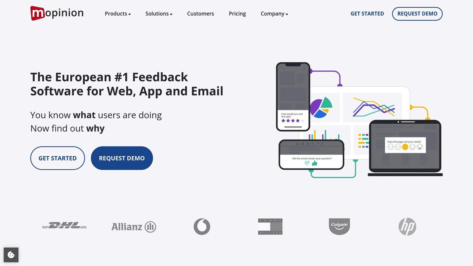
Mopinion is a user-friendly tool designed to collect feedback directly from websites. Its standout feature? Users can click on specific website elements to provide precise, contextual feedback. This approach ties feedback to exact parts of a page, helping development teams pinpoint issues more effectively. By focusing on specific elements, Mopinion simplifies the process of identifying and addressing user concerns.
The platform specializes in on-page surveys and offers advanced targeting options. These features allow teams to gather feedback from particular user groups or specific sections of a website. Mopinion combines analytics with feedback management and is aimed squarely at larger businesses. A review score quoted here previously has been removed as unsourceable.
Customizable Visualizations
Mopinion goes beyond basic feedback collection by offering tools that capture visual context and comments directly from live websites. Its smart labeling system automatically organizes feedback into categories, making it easier to spot trends. Customizable dashboards allow different teams to focus on what matters most to them – digital marketers might analyze conversion funnel feedback, while UX teams dig into usability concerns. The platform’s segmentation and targeting capabilities are especially helpful for large teams working with diverse user groups or website sections. To top it off, Mopinion turns raw data into visual formats like charts and graphs, simplifying decision-making.
Integration with Other Tools
Mopinion integrates with popular tools like Slack, Jira, and Google Analytics. Feedback can trigger real-time Slack notifications, be converted into actionable Jira tickets, or be linked to user behavior data in Google Analytics, making it easier to act on insights quickly.
Pricing Options and Plans
Mopinion has renamed and repriced its plans. Its pricing page now lists Standard from €279 per month and Enterprise from €999 per month, quoted in euros, with monthly and annual billing. The “Growth at $229” and “Turbo at $579” figures that used to appear here refer to plans Mopinion no longer sells, and the dollar sign was wrong as well; both have been removed. Note that “from” is doing work in those numbers — the final figure depends on traffic and feedback volume, so get a quote. Checked August 2026. At this level Mopinion is an enterprise purchase, not a small-business one.
Use Cases for Different Industries
Mopinion’s targeted features make it versatile across industries:
- Digital Marketing Teams: Use contextual feedback to fine-tune conversion funnels and identify pain points in user journeys.
- Customer Experience Teams: Analyze feedback from segmented user groups to prioritize improvements that have the most impact.
- E-commerce Companies: Address issues on product pages or during checkout with the point-and-click functionality.
- SaaS Companies: Gather user input on new features or interface changes, and feed it into product development.
With its focus on precise feedback, advanced integrations, and enterprise-ready features, Mopinion deserves its place among the top visualization tools.
6. UserZoom
Name check first: UserZoom no longer exists as a separate product. UserZoom and UserTesting merged on 3 April 2023 and the combined company kept the UserTesting name; UserZoom’s research capabilities, its QXscore benchmarking and its insights hub were folded into the UserTesting platform. If UserZoom is on your shortlist, search for UserTesting instead. The description below covers what that capability does.
UserZoom was a UX research platform designed to turn user feedback into straightforward, actionable insights. It focused on remote usability testing and analyzing user behavior, and that work now sits inside UserTesting. By simplifying complex research data into formats that are easy to grasp – whether you’re a technical expert or not – it helps organizations make informed product decisions. Plus, its advanced analytics engine takes large-scale user data and translates it into insights that truly matter.
Customizable Visualizations
The platform provides a range of tools to visualize data, including interactive dashboards, heatmaps, click maps, and journey flows. These can be customized to align with specific research goals or stakeholder requirements. These visualizations make it easier to pinpoint usability issues, identify user pain points, and uncover behavioral patterns that can inform improvements. Guided walkthroughs and templates help teams present findings in a clear and engaging way, while detailed filtering lets users segment data on the fly. Even for large-scale projects, the platform ensures feedback remains organized and actionable.
Integration with Other Tools
The platform integrates with widely used tools to improve workflow efficiency. It connects with analytics, project management, and collaboration tools like Slack, Jira, and Salesforce, as well as data visualization platforms such as Tableau and Power BI. These integrations make it easier to transfer feedback data automatically, centralize reporting, and collaborate across teams. This is especially valuable for distributed teams and enterprises managing complex projects.
Pricing Options and Plans
No rates are published. UserTesting sells annual subscriptions quoted per company, usually scaled by seats and study volume, and it will not give you a figure without a sales conversation. Budget for an annual commitment rather than a monthly one.
Use Cases for Different Industries
The platform proves its value across a variety of industries and team setups. Tech companies rely on it to test new features and refine user flows. Financial services use the platform to ensure compliance and improve the usability of digital banking tools. In healthcare, it helps gather patient feedback on telehealth platforms, while e-commerce businesses analyze customer journeys to boost conversions. Whether for quick usability tests or in-depth research, the platform adapts to meet different needs.
UserTesting provides onboarding sessions, live webinars, a knowledge base, and account managers for enterprise clients.
7. Atarim
Atarim is aimed at agencies, developers and designers, offering a way to annotate live websites for instant, contextual client feedback. By cutting out endless email threads, it simplifies communication and ensures everyone stays on the same page. Originally launched as WP Feedback, Atarim has expanded to support all kinds of web projects, making it a go-to tool for web professionals looking to streamline their workflows.
Customizable Visualizations
Atarim shines with its real-time, interactive feedback system. Users can annotate screenshots, draw directly on web pages, and pinpoint specific design elements that need attention. This approach makes it easy to spot and fix usability issues, design flaws, or content errors without relying solely on written descriptions. Everything is neatly organized in a centralized dashboard, which consolidates feedback, tasks, and project communications in one place. This setup not only simplifies progress tracking but also makes managing projects more efficient, and fits into existing workflows.
Integration with Other Tools
One of Atarim’s standout features is its ability to integrate with popular project management and communication tools like Trello, Asana, Slack, and Zapier. These integrations automatically turn feedback into actionable tasks or tickets, ensuring nothing gets overlooked and everyone stays aligned. On top of that, Atarim offers custom branding and white-labeling options, allowing agencies to deliver a polished, professional experience to their clients.
Use Cases for Different Industries
Web agencies, digital marketing teams and in-house design departments use Atarim to cut the round-trips in a review cycle; freelancers use it to keep client feedback out of their inbox. A claim that it cuts delivery times “by as much as 80%” appeared here without a source and has been removed. Atarim does not publish prices on a public page either, so ask.
8. Canva
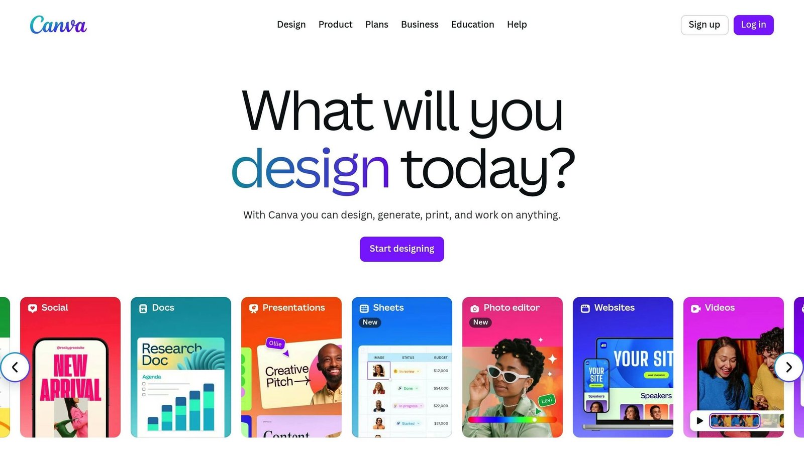
Canva makes visualizing feedback a breeze. While many recognize it as a graphic design platform, it’s also become a favorite for teams looking to transform raw feedback into polished, professional reports – no advanced design skills required.
Here’s a closer look at how Canva simplifies feedback reporting through its customization options, integration capabilities, and versatility for various industries.
Customizable Visualizations
Canva shines when it comes to creating infographics, charts, and diagrams. Its drag-and-drop interface and extensive library of templates make it easy to customize fonts, colors, icons, and layouts to suit your needs. You can even copy and paste data directly from spreadsheets, then tweak every visual element to align with your brand or presentation style.
The template library is packed with ready-made designs tailored for survey results and data visualization. These templates incorporate storytelling tools like maps, icons, and visual narratives, helping you turn numbers into clear, compelling visuals. Whether you’re preparing a customer satisfaction report or illustrating employee feedback trends, Canva’s focus on visual storytelling ensures your data is both engaging and easy to understand.
Integration with Other Tools or Platforms
Canva does collaboration as well as design. It integrates smoothly with tools like Google Drive, Dropbox, and Slack, making it simple to share and access files. Plus, its cloud-based system allows you to share designs via a URL or export them as files.
With real-time collaboration features, multiple team members can work on the same project simultaneously. Commenting tools further streamline the feedback and revision process, cutting down on endless email exchanges and speeding up project timelines. This collaborative setup ensures everyone stays aligned when presenting feedback visually.
Pricing Options and Plans
Canva offers options to fit different budgets and needs:
- Free: US$0, one person.
- Pro: US$180 per year for one person.
- Business: US$250 per year per person, for teams.
- Enterprise: contact sales.
Canva has restructured since this article was written. There is no longer a plan called “Canva for Teams” — Business replaced it — and the old figures ($14.99 a month, $119.99 a year, $29.99 for five seats, $5.99 per extra seat) no longer match anything Canva sells. All have been corrected against Canva’s pricing page, August 2026.
Use Cases for Different Industries or Teams
Canva’s versatility makes it a go-to for teams across various departments:
- Marketing teams and content creators use Canva to transform customer feedback into visually appealing social media posts, client presentations, and stakeholder reports. Its ability to quickly create branded visuals is especially useful for agencies and consultants managing multiple clients with unique branding needs.
- HR and internal communications teams rely on Canva to present employee satisfaction surveys, engagement metrics, and organizational feedback in formats that resonate with both leadership and staff.
Small businesses and freelancers also benefit from Canva’s intuitive design tools. It eliminates the need for hiring professional designers while delivering results that look polished and professional.
Canva is the safe choice if nobody on the team designs for a living: the templates are decent, the output is clean and the learning curve is close to flat. A review score quoted here previously has been removed as unsourceable. For teams on a tight budget it remains a practical way to present feedback data.
9. Feedbackify
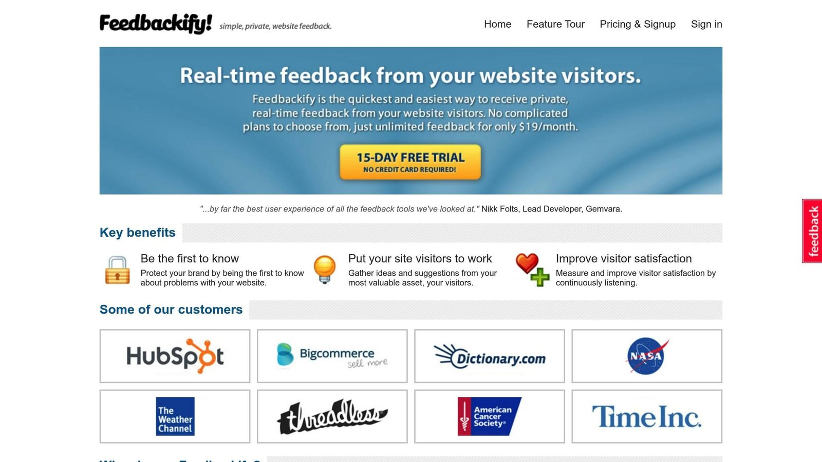
Feedbackify focuses on turning feedback into clear, actionable insights through easy-to-understand visualizations. It equips users with tools to quickly analyze data and make informed decisions.
The platform specializes in creating visual representations like bar graphs, pie charts, and trend lines. These can be customized with different color schemes, filtered by date or category, and exported for presentations. These features make it easier to share insights with teams or stakeholders effectively.
Integration with Other Tools or Platforms
Feedbackify works with tools like Slack, Trello, and Jira. It also offers API access for custom integrations, making it possible to connect feedback data with existing CRM systems or analytics platforms. This flexibility enhances reporting and automation, making it a versatile choice for businesses with diverse needs.
Pricing Options and Plans
Feedbackify does not publish a price. Its site advertises a 15-day free trial and links to a pricing page that was returning an error when we checked in August 2026. Earlier versions of this article quoted “$49 per month” in one place and “custom quote” in another; neither could be confirmed against the vendor, so both have been removed. Treat Feedbackify as a sign-up-and-see option rather than one you can budget for in advance, and check the site is still actively maintained before you rely on it.
Use Cases for Different Industries or Teams
- E-commerce: Visualize customer satisfaction trends.
- SaaS providers: Track usability and gather user feedback.
- Marketing agencies: Collect and analyze campaign feedback.
- Retail businesses: Monitor customer sentiment after product launches.
- Software development teams: Track bug reports and feature requests.
Data Security and Privacy
Feedbackify prioritizes data security with role-based access controls and compliance with U.S. regulations like the California Consumer Privacy Act (CCPA). Data is encrypted both during transit and at rest, and audit logs are maintained to ensure transparency in data access and usage.
User-Friendliness for Teams with Limited Technical Expertise
For teams without a technical background, Feedbackify offers drag-and-drop customization tools and pre-designed templates for visualizations. Its step-by-step onboarding process, paired with dedicated U.S. support through live chat and email, ensures that even non-technical users can get started with ease.
10. Zoho Survey
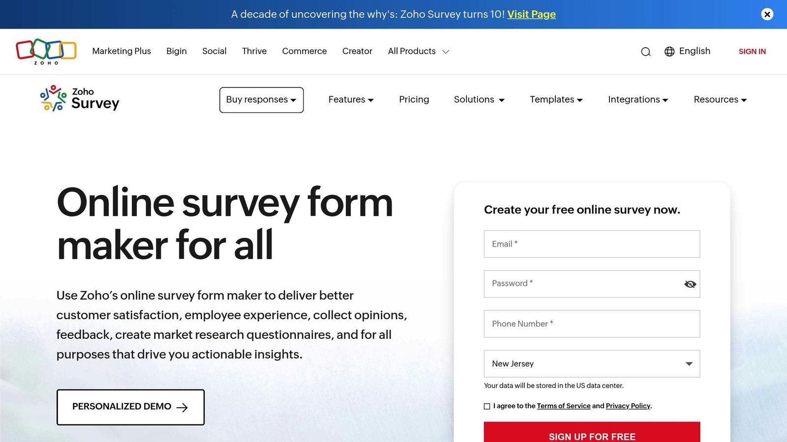
Zoho Survey rounds out our list as a versatile tool for gathering and visualizing feedback, especially for those already using the Zoho suite. It combines intuitive survey creation with built-in visualization features, making it simple to turn responses into clear, actionable insights. With advanced logic options and multilingual support, it’s well-suited for creating customized surveys while automatically generating visual reports to streamline feedback management.
Customizable Visualizations
Zoho Survey provides a variety of visualization options to present survey results, including bar charts, pie charts, line graphs, and word clouds. Users can tweak colors, labels, and chart styles to match their branding and reporting preferences. For those needing more advanced data analysis, Zoho Survey integrates with Zoho Analytics, which turns basic survey reports into fuller analysis.
Integration with Other Tools or Platforms
Zoho Survey works with business tools like Zoho CRM, Google Sheets, Mailchimp, and Slack. These integrations allow for automated data syncing and smoother workflows, making it easier for businesses to connect survey data with CRM systems, email campaigns, and team collaboration platforms. The Slack integration stands out by enabling real-time feedback tracking – sending instant notifications for new responses and allowing teams to share visualized results directly in Slack channels. This connectivity enhances the efficiency of feedback analysis and decision-making.
Pricing Options and Plans
Zoho Survey has a free plan — unlimited surveys, ten questions each, 100 responses a month. Above that the tiers are Basic, Plus, Pro and Enterprise, and Zoho’s US pricing page did not display rates for any of them when we checked in August 2026. The “$25 Standard” and “$75 Enterprise” figures that used to appear here name plans Zoho no longer lists, so both have been removed. Zoho prices differ by region and it is one of the cheaper options in this list, but you will have to get the current figure from Zoho.
Use Cases for Different Industries or Teams
Zoho Survey is widely used across various industries. Healthcare providers rely on it to analyze patient satisfaction data, identifying trends to improve care quality. Retail businesses use it to gather feedback on product launches and customer experiences, while HR teams in tech companies visualize employee engagement data for better decision-making. Its offline data collection feature is especially useful for field research or events with limited internet access. Educational institutions also take advantage of Zoho Survey to collect and analyze student feedback on courses and campus services, ensuring they meet the needs of their communities.
Tool Comparison Chart
Here’s a breakdown of the top 10 feedback visualization tools, comparing their features, pricing, and primary use cases.
| Tool | Best For | Key Features | Starting Price | Free Plan | Primary Use Cases |
|---|---|---|---|---|---|
| Sisense | Enterprise analytics | AI-powered insights, real-time dashboards, handles large datasets | Custom quote | No | Large organizations needing advanced analytics and complex data processing |
| Venngage | Non-designers, marketing teams | Infographics, templates, real-time collaboration | $10/user/month, billed yearly | Yes (limited) | Marketing reports, educational materials, visual storytelling |
| Infogram | Simple infographics | Charts, maps, basic reports | $19/month, billed yearly | Yes | Quick data visualizations, social media graphics, simple presentations |
| SurveyMonkey | Survey data visualization | Basic charts, survey distribution, automated reporting | $30/user/month, 3-user minimum | Yes | Customer satisfaction surveys, market research, employee feedback |
| Mopinion | Digital feedback collection | Custom forms, multi-channel dashboards, user permissions | From €279/month | No | Website feedback, app user experience, digital product optimization |
| UserZoom (now UserTesting) | UX research teams | Advanced user testing, heatmaps, journey mapping | Custom quote | No | User experience research, usability testing, customer journey analysis |
| Atarim | Web development teams | Visual collaboration, website annotation, project management | Custom quote | Yes | Website feedback collection, design reviews, client collaboration |
| Canva | Design-focused visualization | Templates, drag-and-drop design, brand consistency | US$180/year per person (Pro) | Yes | Social media reports, presentation graphics, branded visualizations |
| Feedbackify | Website feedback | Simple feedback widgets, basic analytics | Not published | Yes | Website user feedback, customer satisfaction tracking, quick polls |
| Zoho Survey | Zoho ecosystem users | Multilingual support, advanced logic, Zoho integrations | Not published | Yes | Employee surveys, customer research, educational feedback |
Key Takeaways
Each tool caters to specific business needs, offering a range of features and pricing models. For example:
- Enterprise tools like Sisense and Mopinion are designed for larger organizations, offering advanced analytics and scalability. These tools often require custom quotes.
- User-friendly platforms such as Canva and Venngage provide straightforward pricing and are ideal for marketing teams or non-designers.
- Specialized tools like SurveyMonkey and Feedbackify focus on niche use cases like surveys or website feedback, making them great for targeted tasks.
Pricing varies enormously, from Mopinion at €279 a month upwards to Canva and Venngage in the tens of dollars. It’s also worth noting that tools requiring technical expertise, such as Sisense, are better suited for teams with advanced analytics needs, whereas tools like Infogram are more accessible for quick, simple visualizations.
Lastly, ensure the tool aligns with your industry’s compliance standards. Enterprise-grade platforms such as Sisense carry more security certification; smaller tools often provide only basic protections. Select the tool that best fits your organization’s size, technical requirements, and budget.
Conclusion
Choosing the right feedback visualization tool changes how quickly a business notices what its customers are telling it. Two figures — a 30% improvement in decision-making speed and a 25% rise in customer satisfaction — used to appear in this paragraph without a source. Neither could be traced, so both have been removed.
These benefits come from the variety of features offered by different tools. For instance, enterprise-grade platforms like Sisense provide AI-driven analytics, while user-friendly options such as Canva and Venngage make creating visualizations accessible to teams without technical expertise. Meanwhile, niche solutions like Mopinion and UserTesting (formerly UserZoom) cater to specific feedback challenges, ensuring tailored insights for unique business needs.
The key is to pick a tool that matches your team’s size, technical skills and budget. A retention statistic credited to a survey by The CX Lead previously sat here; we could not find the survey, so the figure has been removed and nothing invented in its place.
Real-time visualization tools with multi-platform integration are becoming essential for maintaining a competitive edge. By addressing customer concerns immediately through visual dashboards, businesses can tackle small issues before they escalate into larger problems.
For those unsure where to start, platforms like BizBot offer curated directories of feedback visualization tools, simplifying the selection process and saving valuable time.
Investing in a feedback visualization tool isn’t just about improving processes – it’s about fostering a customer-first mindset. When paired with the right strategy, these tools can deliver measurable results, helping businesses achieve their goals while keeping customer satisfaction at the forefront.
FAQs
How can feedback visualization tools help businesses make better decisions and enhance customer satisfaction?
Feedback visualization tools take customer input and turn it into easy-to-understand visuals like charts, graphs, and dashboards. These visuals help businesses quickly spot trends, uncover problem areas, and decide which customer needs to address first.
By breaking down complex data into digestible visuals, teams can make quicker, more informed decisions. This not only streamlines processes but also allows businesses to fine-tune their services to align with customer expectations. The result? Happier customers and better overall business performance.
What should you consider when selecting a feedback visualization tool for your industry or team size?
When selecting a feedback visualization tool, you’ll want to think about a few key factors: the size of your team, the specific needs of your industry, and how complex your feedback data is. A tool that fits perfectly for a small team might struggle to keep up as your organization grows, so it’s crucial to choose something that can manage both your current and future data demands.
Focus on tools that offer customizable dashboards, integration with your existing software, and real-time updates – these features can make your workflow much smoother. Don’t forget to assess how user-friendly the tool is, its pricing model, and the quality of customer support. These details can make all the difference in ensuring the tool fits within your budget and supports your team’s day-to-day operations effectively.
How do platform integrations improve feedback visualization tools?
Integrating feedback visualization tools with other platforms takes their functionality to the next level by allowing effortless data sharing and delivering richer insights. When connected to systems like CRMs, project management tools, or survey software, these tools can gather data from multiple sources, creating a fuller picture of user feedback.
This integration doesn’t just save time – it helps businesses spot trends, make smarter decisions based on data, and boost teamwork across departments. For instance, linking a CRM with feedback tools can tie customer feedback directly to individual profiles, giving teams valuable context to make more informed choices.
More on this topic
Browse all 53 articles on Data & Analytics.